


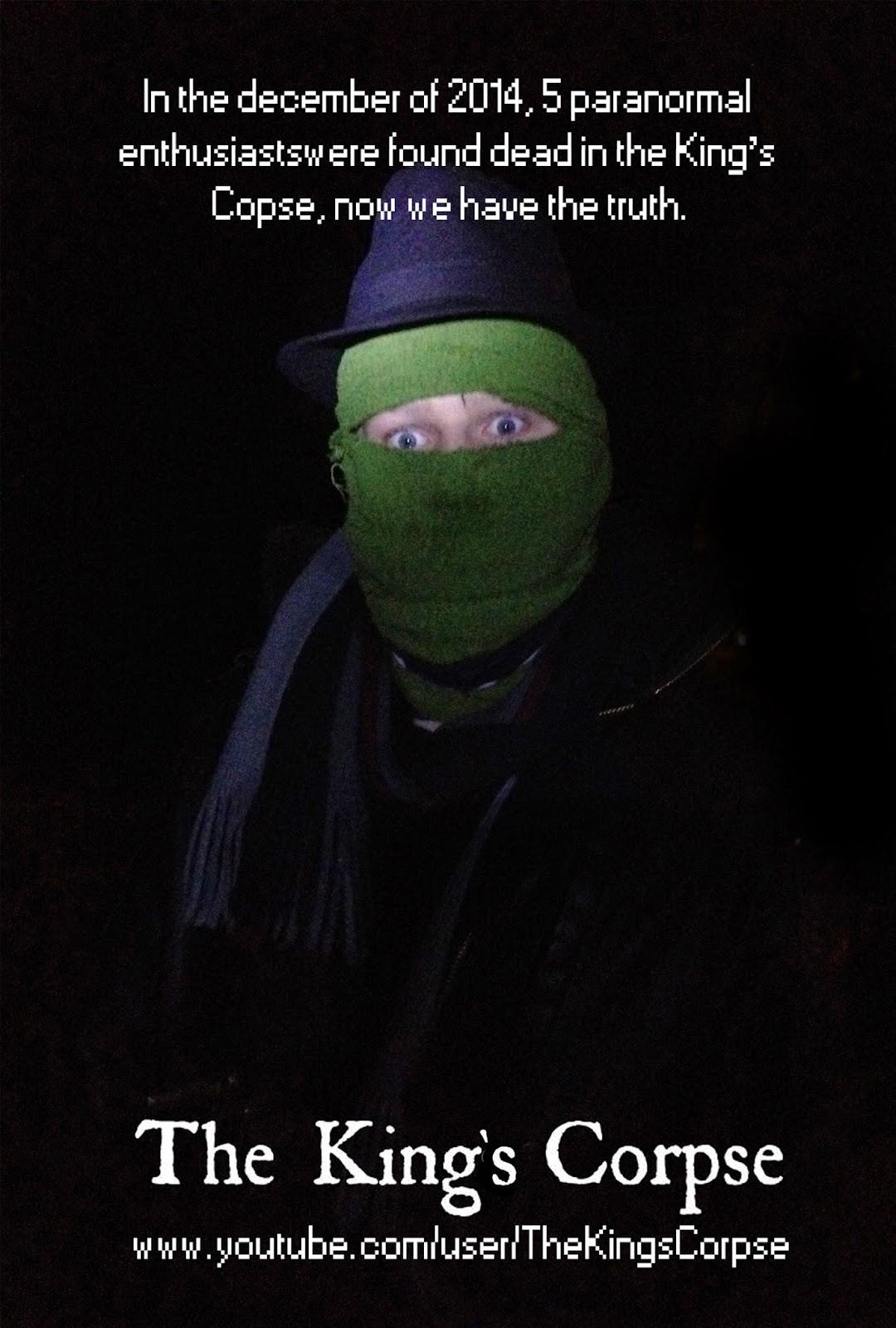
 I went on dafont.com for a few ideas on the logo for the poster. The reason I kept it simple was because the person creating this is not skilled at graphic design so would not create a specific logo for it. The ones pictured are my favourites from the search and I chose the fourth one in the end, because it is bold and easily read, whilst not looking completely conventional. I used the picture below as the image for the final poster as it was the closest to how the rest of the film looks and has the clearest image of the killer's face. I started by using a black paintbrush tool to remove the lights in the background. I then cropped the image so it was 40" by 27" as that is the conventional movie poster dimension. I then inserted the logo as well as the text, one consisting of the page where the film would be found and the text explaining the story. I did not alter the image's white balance, brightness etc. as the picture is supposed to be found on the same device as the footage, so it would look the same as the footage.
This closely resembles The Blair Witch Project's poster but instead of the protagonist's picture, the killer is present on the poster.
No comments:
Post a Comment